Eagles Financial Solutions


Branding, Responsive Website

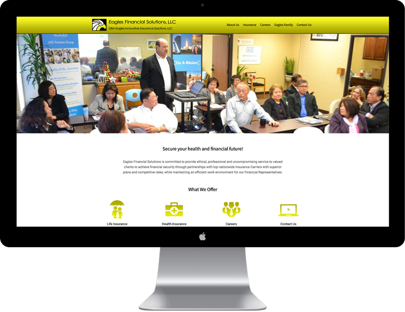
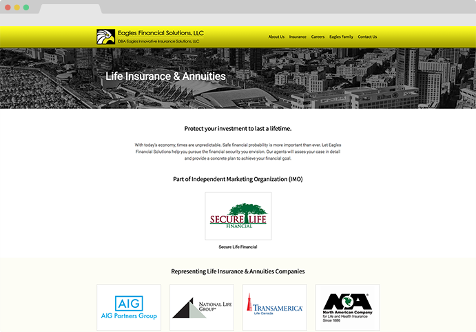
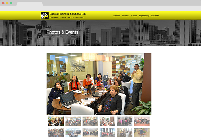
Eagles Financial Solutions is a website about life and health insurance, and for people looking for career opportunities in this industry.

The idea was to create a design and branding that's clean, simple and easy to use. The responsive design maximizes organization, legibility and presentation of information across multiple devices.

My role in this project

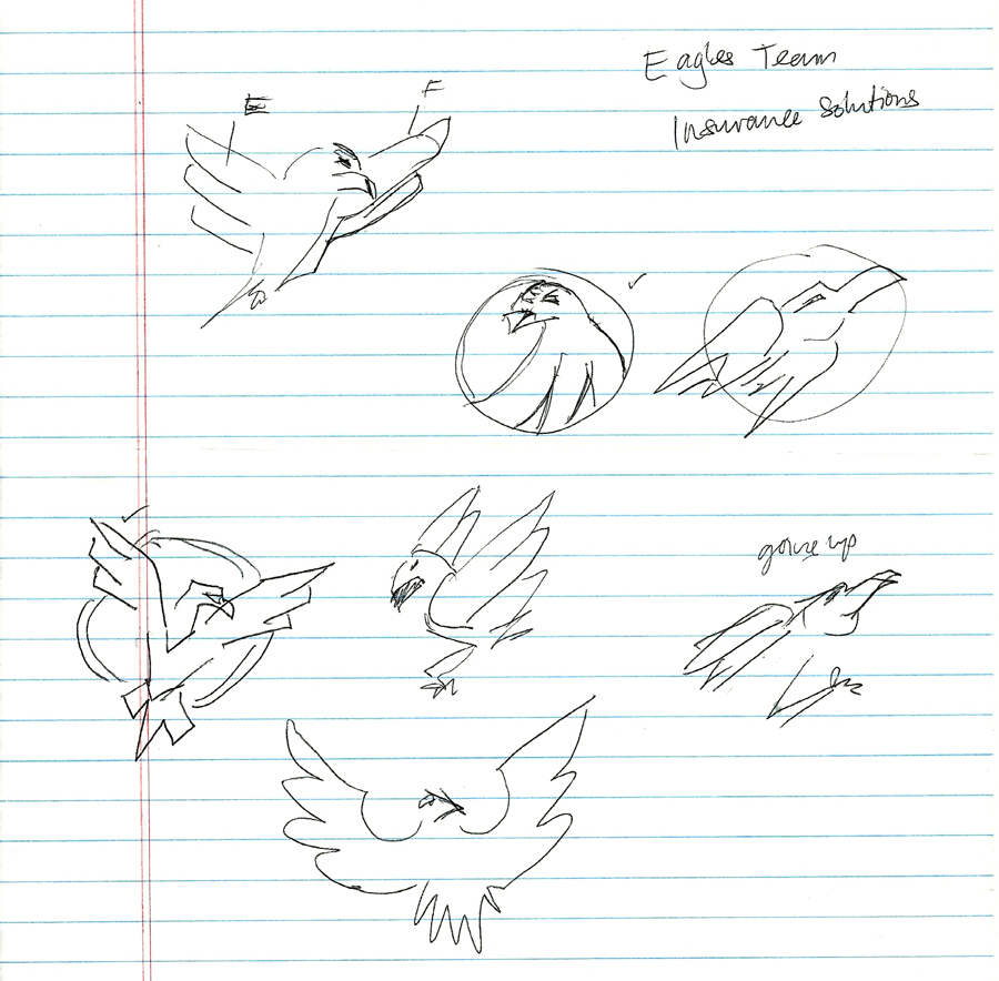
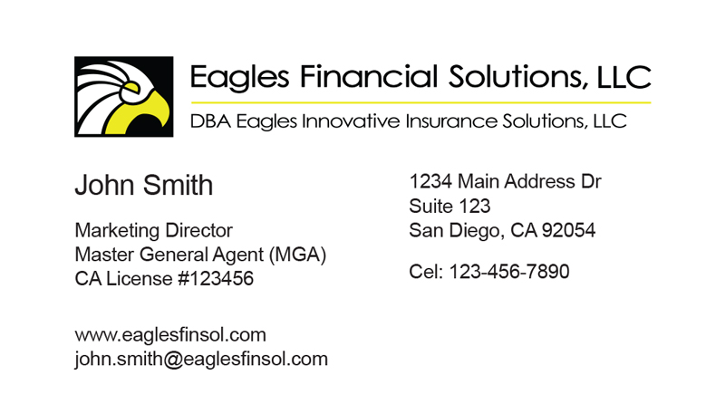
Art direction, UI design, Coporate ID design, Front-end development

Eagles Financial Solutions

Branding Strategy


The client wanted to be represented as a strong american company of ambition and goals. The agreed representation would be an american eagle, and these also followed the choosing of the color pallet (Black, White and Yellow Gold). I sketched some designs for the icon, almost similar to a shape of a "phoenix" rising.

However, I suggested something much simpler than a whole eagle, so the brand will be much more memorable and impactful. The final design was only the head of the eagle for simplicity, with some play of negative and postive space to give more meaning to the design.

Eagles logo sketch
Final logo design

The client also requested for a business card design, and the result was a clean layout that reflects the branding and website.

Business card design, Front
Business card design, Back

Website UI Design


We envisioned a website that's a hub to access more information about the industry. Company brands were organized in a simple layout for easier use. Since the company's goal also focuses on career recruitment, we included a photo slideshow of company activities and team directory for inquiries and add a personal touch.

View Live Site
Life Insurance and Annuities page
Photos and Events page
View Next Project

Say Hello.


Thank you for your time. Please advise for any questions. Have a nice day!